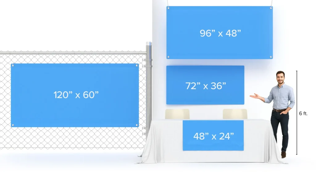
Custom Banner Sizing is a foundational skill for crafting impactful digital and print campaigns that capture attention and communicate clearly, guiding how you balance visuals, copy, and brand voice. Getting the right choices ensures legibility, fast loading, and consistent branding across devices, from large desktop displays to tiny mobile screens, across websites, emails, and apps. When banners respect proper proportions, they read clearly, avoid distortion, and reinforce your message rather than competing with it, which helps trust and recall in busy digital environments. This intro highlights practical principles for sizing, including choosing sizes that fit your design goals, align with brand standards, and optimize files for speed across networks. By planning with appropriate sizes in mind, you can deliver visuals that perform well wherever they appear, including dashboards, emails, and social feeds for diverse audiences.
Framing the topic through banner size guidelines helps teams map placements, prioritize legibility, and ensure consistency across campaigns while accommodating diverse screens and contexts. From the lens of digital banner dimensions, designers balance resolution with file size, so visuals stay sharp without slowing pages, loading times, or user frustration. Understanding web banner sizes supports a scalable approach, enabling multiple cuts that render reliably in websites, emails, and social feeds, and that align with ad network specs. A practical sizing strategy combines the concept of sizing with consistent banner dimensions and proportional crops to preserve branding, while also considering accessibility and contrast. By tying these ideas to accessibility, performance, and testing across devices, you create campaigns that perform well on SEO metrics, improve engagement, and reinforce your brand narrative. This approach also supports testing and iteration, ensuring your banners adapt as platforms evolve and user expectations shift.
Banner Dimensions Demystified: Key Banner Dimensions Across Platforms
Understanding banner dimensions is foundational to any successful campaign. When you align banner dimensions with the target placement, you improve readability, reduce distortion, and ensure faster load times, which all contribute to better engagement. Common banner sizes for web banners include 728×90 for desktops, 970×250 for larger placements, and 300×250 for in-article blocks, while mobile banners often use 320×50 or 320×100. For hero sections, a range like 1200×400 to 1600×600 provides a cinematic presence without cropping key elements. Email banners tend to stay around 600×200 to 600×250 to fit single-column layouts. All of these exemplify banner dimensions that align with different placements and should be considered part of your digital banner dimensions strategy.
Designing with the right aspect ratios helps future-proof assets. Favor scalable vectors for logos and typography where possible, and design around the safe zone to keep important text visible on varied devices. When in doubt, design from the intended display size and scale down, rather than enlarging a small bitmap. Matching these banner size guidelines across placements reduces cropping, distortion, and pixelation, preserving brand credibility.
Choosing Web Banner Sizes: Desktop, Mobile, and Email—What You Need to Know
Choosing web banner sizes requires balancing visibility, performance, and placement. Desktop hero banners may use 1600×600 or 1200×600 depending on layout, while traditional web banners like 728×90 and 970×250 continue to serve banner campaigns effectively. Mobile campaigns benefit from compact sizes such as 320×50 and 320×100 to maintain legibility without overburdening bandwidth. When planning, think in terms of digital banner dimensions and build a set of web banner sizes that covers desktop, mobile, and email placements.
Develop a multi-version approach: create several size variants of the same creative, maintain consistent branding, and tailor assets to each platform’s constraints. Use responsive techniques like srcset or CSS background-image scaling to ensure the right asset is delivered for the user’s device. By using banner size guidelines as a baseline, you can optimize user experience and conversions across websites, social channels, and newsletters while keeping file sizes reasonable.
Custom Banner Sizing: A Practical Workflow for Consistent Branding Across Platforms
Custom Banner Sizing is an intentional process that starts with mapping placements and selecting baseline sizes that cover those placements. Define 3–5 core sizes—one primary size and several alternatives—to balance reach and performance. By aligning sizes with where the banner will appear, you’re using Custom Banner Sizing to maintain visual integrity across websites, email clients, and social feeds. This approach echoes banner size guidelines that emphasize coverage of common placements and flexibility for future campaigns.
Next, design at the largest required size and scale down for other placements, ensuring critical elements stay within a safe zone. Prepare assets in appropriate formats—PNG for logos and flat graphics, JPEG for photos, and SVG where scalable vector quality matters. Test across platforms and devices, then expand your set as new placements emerge. This workflow anchors your digital banner dimensions strategy in practical steps that support consistent branding.
Optimizing File Formats, Compression, and Accessibility for Digital Banner Dimensions
Optimizing file formats and compression is essential to maintain performance without sacrificing visual quality. Large banners slow pages and emails, so aim for the smallest file size that preserves clarity. For flat-color graphics, PNG-8 or optimized JPEGs can be effective, while photographs benefit from JPEG compression; use PNG when transparency is needed. If you have vector assets, SVG exports help preserve crispness at any size, and you can implement responsive banners with srcset or similar techniques to serve appropriate dimensions, aligning with banner size guidelines and digital banner dimensions.
Accessibility and searchability aren’t optional: use descriptive file names and alt text that explain the banner’s purpose, and ensure text remains legible with sufficient contrast. Maintaining accessibility contributes to a positive user experience and can indirectly boost SEO. As you optimize delivery, consider how banners perform with screen readers and on touch devices, and pair that with fast loading practices to keep engagement high across devices and networks.
Testing, Validation, and Performance: Ensuring Banners Look Great on All Screens
Testing, validation, and performance testing ensure banners render correctly on all screens before you scale a campaign. Preview desktop and mobile layouts, verify that the safe zone keeps essential text visible, and confirm that files load quickly on varied connections. Platform-specific tests include email clients, social networks, and ad networks, revealing where cropping or distortion may occur, letting you adjust banner dimensions to match each environment while still honoring digital banner dimensions.
Use analytics and iterative testing to refine your approach. Track metrics like load time, CTR, and conversion rate to gauge whether current web banner sizes meet expectations, and be prepared to generate additional versions if performance dips. A disciplined testing workflow, grounded in banner size guidelines, ensures your creative remains sharp, readable, and effective across websites, email newsletters, and social media.
Frequently Asked Questions
What is Custom Banner Sizing and why does it matter for digital and print marketing?
Custom Banner Sizing is the process of selecting appropriate banner dimensions, aspect ratios, and file formats to ensure your message is legible, loads quickly, and stays on-brand across websites, emails, and social platforms. By focusing on banner dimensions and digital banner dimensions, you avoid cropped text or distorted imagery. Following banner size guidelines helps maintain consistency across placements, making Custom Banner Sizing essential for readability, performance, and a credible brand presence.
What are the most common web banner sizes and how should I choose them using banner size guidelines?
For web banners on desktop, use baseline sizes like 728×90 Leaderboard, 970×250 Billboard, and 300×250 Medium Rectangle. For mobile web banners, consider 320×50 and 320×100. For hero areas, 1200×400 to 1600×600 work well. When choosing sizes, align with the actual placements, design with a central safe area, and follow banner size guidelines to cover both web banner sizes and responsive needs.
How can I optimize files while practicing Custom Banner Sizing to balance quality and speed?
Optimize by matching file formats to content: PNG for transparency or flat graphics, JPEG for photography, and SVG for logos. Compress carefully to reduce file size without noticeable quality loss. Design at the largest size you’ll need and scale down for other placements, preserving essential elements within the banner dimensions. Use responsive delivery (such as srcset) to serve appropriate sizes across devices while maintaining consistent Custom Banner Sizing.
How should I test banners across devices to ensure Custom Banner Sizing is effective?
Test banners on desktop and mobile to verify that dimensions render correctly, important text stays within the safe zone, and cropping doesn’t affect the message. Check readability and appearance across different screen sizes, platforms, and, if applicable, email clients. Monitor load times and visual consistency for web banners, and apply similar checks to social banners to ensure the digital banner dimensions remain strong across placements.
What is a practical workflow for implementing Custom Banner Sizing?
A practical workflow includes: 1) Define placements (website hero, side banners, email header, social cover). 2) Choose baseline sizes (3–5 options) with one primary size. 3) Create assets at the largest size and scale down for other placements. 4) Optimize files (PNG for transparency, JPEG for photos, SVG for logos). 5) Test across platforms and devices. 6) Iterate by adding new sizes as campaigns evolve. This approach aligns with banner size guidelines and ensures consistent Custom Banner Sizing.
| Aspect | Key Points |
|---|---|
| Concept and Goal | Custom Banner Sizing is a foundational skill for digital and print marketing; aim to align sizes with design goals to maximize legibility, impact, and fast loading across devices. |
| Why it matters | Proper banner dimensions prevent cropping, distortion, and unreadable CTAs; consistency supports readability, brand credibility, and performance across screens. |
| Common sizes and uses | Web banners (desktop): 728×90, 970×250, 300×250; Web banners (mobile): 320×50, 320×100; Hero banners: 1200×400–1600×600; Email banners: ~600–650 px wide; Social banners: Facebook 1200×628, Twitter 1500×500, LinkedIn 1584×396, YouTube 2560×1440 (safe area). |
| Aspect ratios and resolution | Design in pixels; use aspect ratios like 16:9 (and 4:1 for large horizontals); scale as needed; print uses ~300 DPI, digital typically 72–150 PPI; scalable assets (SVGs) help maintain quality. |
| Typography and readability | Test typography at smaller sizes, reserve generous negative space, ensure high contrast, and keep essential text within the safe zone for cropping protection. |
| Choosing right sizes and workflow | Plan placements, choose baseline sizes, design the largest needed asset, create alternatives, test across devices, and refine. |
| File formats and optimization | Use PNG for transparency, JPEG for photos, SVG for logos; employ responsive techniques (srcset, CSS scaling) and optimize file sizes for speed. |
| Accessibility and SEO | Use descriptive file names and alt text; ensure legibility of clickable areas; accessible design supports user experience and SEO signals. |
| Common mistakes to avoid | Cropping of critical elements, ignoring mobile/desktop variations, oversized/non-optimized files, inconsistent branding, and reliance on a single size. |
| Putting it all together | Plan, establish a core set of sizes, design at the largest needed size, optimize, test, and iterate to maintain consistency and performance across campaigns. |
Summary
Custom Banner Sizing is a strategic practice that balances display context, user devices, and design priorities to ensure banners are legible, fast-loading, and effective across websites, email, and social platforms. By following practical guidelines for banner dimensions, sizes, and formats, you can craft banners that maintain visual impact while loading quickly. Start with a plan, establish baseline sizes, design the largest needed asset, optimize file formats, and test across platforms to maximize engagement and consistency. With a scalable workflow and a focus on branding, you’ll deliver banners that perform well and support a cohesive brand presence across channels.