Custom Banner Design sets the stage for impactful event spaces, turning blank walls into visual introductions that grab attention. In this guide, we explore how eye-catching signage can convey your core message at a glance and draw people toward your booth. From choosing sizes and materials to color and typography, these practical steps translate your brand into a bold, readable statement. A clear visual hierarchy and a concise call to action help attendees move from interest to engagement. By following these proven approaches, you will create banners that perform from day one at events.
By considering how display graphics speak to audiences at gatherings, you can plan signage that supports your event goals. This approach translates to what designers call event signage design, especially for trade shows, conferences, or celebrations. For practical insights, focus on readable layouts, balanced typography, and brand-consistent color—adapting these ideas to different venues. If you want actionable steps, explore concise, scannable copy and a clear hierarchy. In short, a strategic, well-branded setup helps you communicate value quickly and leave a lasting impression.
1) Custom Banner Design Fundamentals for Effective Event Signage
Effective Custom Banner Design starts with a clear objective and a defined audience. When you translate your brand values into a visual language that can be read from across a crowded expo hall, you create eye-catching signage that draws attendees toward your booth. The goal of Custom Banner Design is not just aesthetics but purposeful communication of who you are and what you offer, enabling quick recognition in a busy environment.
Consider typical event signage design constraints—booth space, viewing distance, ambient lighting—and plan your banner size, material, and finish accordingly. For instance, selecting a 2×4 or 3×6 foot banner with a durable vinyl or mesh helps maintain legibility outdoors, while a matte finish reduces glare under fluorescents. This is where banner design tips come into play: balance bold headlines with ample white space, and align your copy with the audience’s needs to drive action.
2) Typography and Visual Hierarchy: Building Readable Banners at a Distance
Typography is the backbone of effective Custom Banner Design. In the realm of eye-catching signage, choosing fonts with high legibility ensures your message reads clearly from near and far. For clear signage, prioritize sans-serif or clean geometric type for headlines, paired with a legible secondary font for body copy. When you ask how to design banners for events, typography choices often determine whether attendees stop or walk by.
Establish a visual hierarchy that guides the eye: headline, subhead, then supportive details. Use contrast to separate levels and leave generous negative space to prevent crowding. In this aspect of Custom Banner Design, typography is not just decoration—it’s a strategic tool that makes event signage design more accessible to viewers at a glance.
3) Color Theory, Imagery, and Branding for Event Signage
Color theory and imagery should reinforce your branding while considering the event environment. For event signage design, select a color palette that maintains readability and communicates mood—high contrast for readability in bright spaces, more nuanced tones for upscale events. The aim for eye-catching signage is to balance color psychology with legibility so your banner stops foot traffic without overwhelming the copy.
Incorporate imagery deliberately: a single strong icon or photograph can convey value quickly. Ensure images align with brand messaging and do not compete with text. In Custom Banner Design, imagery should harmonize with the overall color scheme and typography, reinforcing your message rather than distracting viewers, which is a common pitfall in event signage design.
4) Layout Templates and Copywriting That Convert on the Event Floor
Layout templates give you repeatable results that scale across events. For banner design tips, use a top headline zone, a middle band for subheads and concise body copy, and a bottom line for a call to action. When you plan how to design banners for events, templates help you maintain consistency across booths or venues while enabling quick adaptation for different campaigns.
Copywriting that converts relies on concise, benefit-driven language and action-oriented verbs. In the realm of eye-catching signage, a crisp headline plus a short supporting line can make a big impact, especially when paired with a visible URL or booth number. Practice testing variations to see which wording resonates in live settings, a strategy that aligns with banner design tips for optimization.
5) Printing, Finish, Durability, and Real-World Testing for Eye-Catching Signage
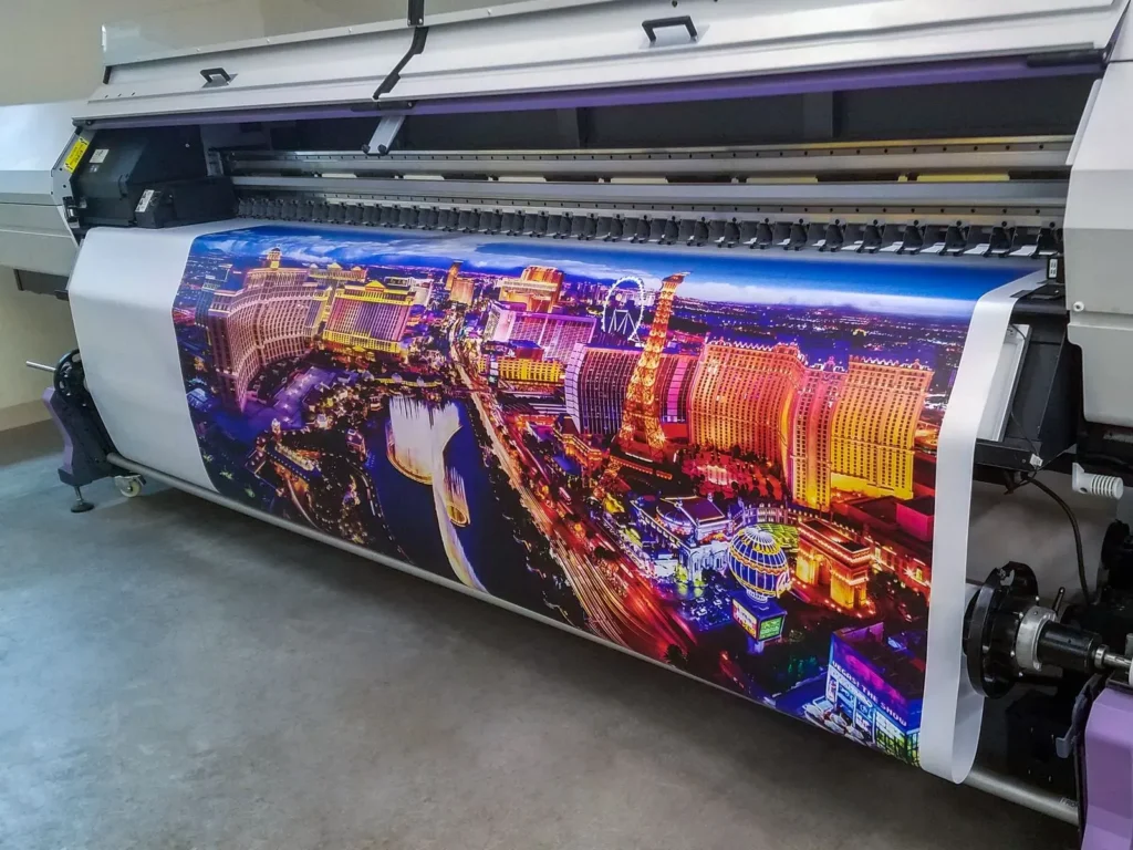
Printing quality and finishing dramatically influence perceived value. For Custom Banner Design, ensure final artwork is high resolution (300 dpi or more) and that fonts are embedded or outlined to avoid substitutions during printing. Choose coatings—matte to minimize glare or gloss to boost color saturation—based on lighting and venue conditions, which is essential for eye-catching signage in any environment.
Durability and test runs reduce surprises on event day. Use weatherproof laminates for outdoor use, reinforced grommets for durability, and plan for transport and storage to prevent creasing. After a live event, collect feedback on readability and impact to inform future banner design tips and improve the overall event signage design across campaigns.
Frequently Asked Questions
What is Custom Banner Design and why is it central to eye-catching signage and event signage design?
Custom Banner Design is the process of crafting banners that grab attention, convey essential information quickly, and reinforce your brand at events. For signage, it informs the eye-catching nature of your booth and aligns with standard event signage design principles by clarifying objectives, audience, and messaging.
How does Custom Banner Design guide choices in sizes, materials, and placement for event signage, and what are some banner design tips?
For Custom Banner Design at events, choose sizes like 2×4 ft or 3×6 ft based on booth space and viewing distance. Outdoor banners should use weather-resistant vinyl or mesh; indoor banners benefit from a matte finish to reduce glare, while glossy finishes can boost color punch. Plan placement and environmental factors to ensure readability and impact.
How can you build a strong visual hierarchy in Custom Banner Design to achieve quick comprehension in event signage design?
To build a strong visual hierarchy in Custom Banner Design, place the most important headline at the top or center, followed by a supporting subhead and concise body copy. Use large bold type for the headline, medium-weight for supporting info, and lighter weight for details like a URL or social handles. Leave generous negative space and balance typography with imagery so the message is read quickly.
What typography guidelines should you follow in Custom Banner Design to ensure legibility from afar, especially when considering how to design banners for events?
In Custom Banner Design, choose legible typography by using high-contrast text and background, preferring sans-serif fonts for distance, and limiting to two or three font families. Aim for a minimum color contrast ratio of 1:10 for headlines and test readability at typical viewing distances. Avoid long blocks in all-caps, and adjust kerning and line height to support quick scanning.
What printing and finishing considerations matter most for durable Custom Banner Design, and how do these relate to eye-catching signage and banner design tips?
Printing and finishing affect perceived value. Use at least 300 dpi artwork, embed or outline fonts, and choose matte or gloss coatings based on lighting. For outdoor use, add UV-resistant lamination and reinforced grommets. If banners are reused, select durable materials that resist bending and repeated roll/unroll cycles.
| Key Point | What It Means | Practical Tips | When It Matters |
|---|---|---|---|
| 1) Objective and Audience | Define the primary message, the target audience, and the desired action; align the design with the objective and translate brand values visually. | State a bold headline and a simple CTA; tailor visuals to the audience and goal (booth traffic vs keynote credibility). Keep the message distance-friendly. | Start of the design process; ensure alignment with event goals. |
| 2) Size, Material, and Placement | Impact readability and durability; select sizes (e.g., 2×4 ft, 3×6 ft) and materials based on venue and weather. | Indoor: matte to reduce glare; outdoor: weather-resistant vinyl; plan for wind, glare, and viewing distance; consider multiple banners for wayfinding. | Early venue planning and layout decisions. |
| 3) Visual Hierarchy | Establish a clear reading order: headline > subhead > body; balance typography with imagery and space. | Use large, bold headline; medium-weight subheads; lighter body text; ensure negative space and avoid clutter. | During layout/design stage to maximize quick comprehension. |
| 4) Typography | Choose highly legible fonts; limit to 2-3 families; ensure high contrast; test readability at typical viewing distances. | Avoid long blocks of text in all-caps; manage kerning and leading; integrate ‘Custom Banner Design’ naturally when mentioned. | Copy/design considered during typography and copywriting phase. |
| 5) Color and Imagery | Use brand-aligned, high-contrast colors; purposeful imagery (one strong photo or icon) to reinforce the message. | Maintain consistency across branding; bold accents to draw attention without overpowering text. | During design and asset selection. |
| 6) Layout and Composition | Create templates around the banner size; plan top headline, middle subhead, bottom CTA; reserve space for QR codes or booth numbers. | Keep logos consistent; align margins and grids; use a simple hero image to convey value quickly. | Layout stage and template development. |
| 7) Copywriting that Converts | Concise, action-oriented copy; highlight a clear benefit; include essential details if space allows. | Test variations; avoid long paragraphs; use short headlines and one-liners; proofread for consistency. | Content development and testing phase. |
| 8) Printing and Finishing | High-resolution artwork; embedded fonts; coating choices (matte/gloss); durability considerations for reuse. | Weatherproof lamination, UV resistance, reinforced grommets; plan for roll/unroll wear. | Production phase. |
| 9) Real-World Examples | Tech conference vs wedding signage show how context affects design choices. | Prioritize readability, branding, and purpose; ensure quick comprehension at a glance. | Benchmarking and case-study review during the analysis phase. |
| 10) Feedback & Iteration | Gather impressions post-event to improve templates and copy. | Make data-driven tweaks to color, typography, and layout; build a best-practices library. | Post-event review and iteration. |
Summary
Conclusion: Custom Banner Design is a practical, repeatable framework for crafting banners that grab attention and communicate your brand at events. The approach integrates objective setting, size and material decisions, visual hierarchy, legible typography, purposeful color and imagery, thoughtful layout, concise copy, durable printing, real-world examples, and ongoing iteration. Used together, these elements help banners perform from day one, supporting brand recognition and guiding attendees through the event environment with clarity and impact. In practice, Custom Banner Design becomes more than signage—it becomes a trusted tool for conveying value, directing traffic, and reinforcing your brand across trade shows, conferences, weddings, and concerts alike.