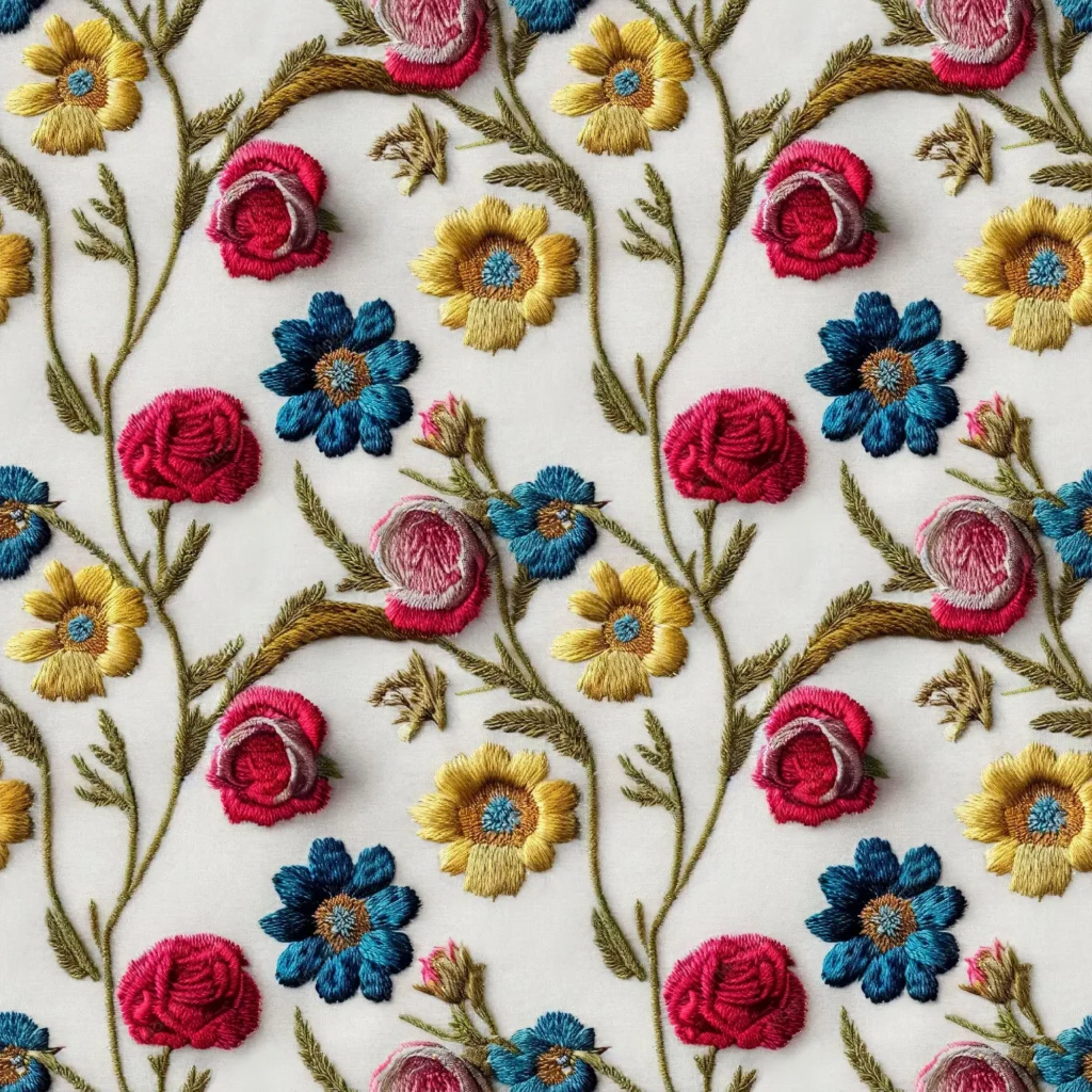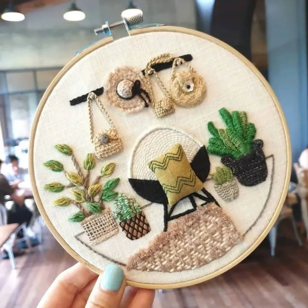
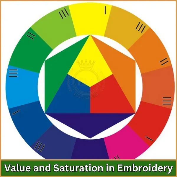
Color Theory for Embroidered Design isn’t just about picking pretty threads. Beyond the basics, embroidery color theory guides how color interacts with fabric, stitches, and lighting to shape mood, depth, and legibility. When you choose the color palette for embroidery thoughtfully, you align hue, value, and saturation to the subject while considering thread color selection. A practical approach also factors in the color wheel embroidery, the effects of fabric matching for embroidery, and how finishes, like matte or silk threads, shift perceived color. By testing swatches and planning for light conditions, you ensure your stitch work communicates clearly and beautifully.
Viewed through a different lens, this field becomes color harmony planning for textiles and stitchwork. It emphasizes hue relationships, value shifts, and temperature cues so threads read consistently on different fabrics and under varied lighting. By framing the task as palette planning, fabric compatibility, and tonal balance, you guide the viewer’s eye while keeping the design cohesive. Practical steps include testing swatches on the actual fabric and simulating light conditions to verify readability. In short, color decisions in embroidery are about matching materials, light, and texture to convey mood with clarity and touch.
1. Color Theory for Embroidered Design: Building Mood, Depth, and Legibility
Color Theory for Embroidered Design isn’t just about picking pretty threads. It’s about understanding how color interacts with fabric, stitches, and lighting to produce mood, depth, and legibility in every piece. By grounding your work in concepts like hue, value, saturation, and temperature, you can craft palettes that guide the viewer’s eye and ensure the design reads clearly from a distance and up close.
This approach translates into practical choices: selecting colors that align with the desired mood, testing their brightness under the light in which the piece will live, and balancing contrast with subtlety. Whether you’re stitching delicate botanicals or bold geometric motifs, a solid grasp of color theory helps you control emphasis, depth, and readability, while keeping the fabric and thread in harmony with the intended story.
2. Color Wheel Embroidery to Palette Creation: From Relationships to a Cohesive Color Palette for Embroidery
Moving beyond instinct, the color wheel provides a map for choosing colors that work together in embroidery. Analogous palettes create harmony by using adjacent hues; complementary palettes offer strong contrast when you want a focal point; triadic schemes bring vibrant balance without overwhelming the eye. Understanding these relationships helps you decide which colors will recede or advance, and how subtle value shifts can add depth to stitching.
As you translate wheel relationships into a complete color palette for embroidery, consider the fabric base and lighting. Start with a focal color for your subject and then choose supporting hues that maintain cohesion. Practical guidance involves testing swatches, comparing values, and evaluating how the palette behaves on the actual fabric under typical viewing conditions, ensuring that the color palette for embroidery remains legible and expressive across the piece.
3. Thread Color Selection: Choosing the Right Threads for Your Palette
Selecting thread colors is the heartbeat of embroidery color decisions. Thread color selection isn’t only about hue; it’s about finish, sheen, and how different fibers (silk, cotton, wool) reflect light. The texture and luster of threads can shift perceived color, so it’s important to test how a chosen thread behaves on your fabric in your lighting scenario. Neutral threads often anchor bold colors, while metallics or iridescents can provide highlights or accents without overpowering the design.
A practical approach to thread color selection includes defining a focal thread for the main subject, then curating 2–3 supporting colors that harmonize. Don’t forget neutrals and grounding tones to balance the composition, and always check dye lots to avoid mismatches in large runs. This careful thread choice, guided by color theory, ensures that the final embroidery maintains color integrity from first stitch to final highlight.
4. Lighting, Fabric, and Texture in Color Decisions for Embroidery
Color perception shifts with lighting, fabric color, and thread finish. Silk reflections may brighten a color, while matte cotton can mute it. The base fabric itself has a strong influence on how your palette reads: a vibrant thread on natural linen may appear more subdued than on bright white. When planning your palette, account for these factors so the piece maintains intended legibility and mood under the lighting where it will be displayed.
Texture adds another layer: the weave and fiber content affect not only how color appears but how detail is perceived at stitch distance. A color that reads clearly in a flat swatch may blur slightly when stitched in satin or long-and-short shading. By testing on fabric swatches, you can align your color choices with the fabric’s character, ensuring that fabric matching for embroidery supports the overall design and storytelling.
5. Palette Strategies for Embroidery: Analogous, Complementary, and Monochrome Schemes
Color palettes for embroidery can be crafted using three foundational strategies: analogous, complementary, and monochrome. Analogous schemes—colors next to each other on the color wheel—create calm, cohesive looks ideal for natural motifs and soft botanical work. Complementary palettes pair opposites for striking contrast, perfect for focal points or bold graphic embroidery. Monochrome palettes use varied values and saturations of a single hue to achieve subtle shading and texture.
Each strategy offers a different mood and level of complexity. For fabric matching for embroidery, the surrounding background and base color influence how vibrant or muted your chosen scheme appears. By combining these palette approaches with neutrals and grounding tones, you can achieve a balanced design that remains visually legible while expressing specific emotion or storytelling.
6. From Concept to Stitch: A Practical Workflow for Color Planning in Embroidery
A structured workflow helps you move from idea to finished embroidery with confidence. Begin by defining the mood and focal point, then consider the fabric base to determine the level of contrast you can support. Build a color map around a primary color, add 2–3 harmonious companions, and select a neutral to ground the composition.
Next, test with swatches and a small mock-up to evaluate brightness, temperature, and contrast under the expected lighting. Refine as needed by replacing colors that feel too bright or dull, adjusting values for legibility, and checking dye lots to avoid mismatches on larger runs. This practical sequence—color theory-informed decisions, thread color selection, and fabric matching for embroidery—helps ensure every stitch serves the intended mood and story.
Frequently Asked Questions
What is embroidery color theory and how does it guide thread color selection?
Embroidery color theory guides thread color selection by explaining how hue, value, saturation, and temperature interact with fabric and light. Start by defining the mood and choosing a focal color, then select supporting hues using color wheel embroidery ideas (analogous or complementary) to create contrast and harmony. Always test colors against your fabric and consider how thread finish and lighting shift perceived color.
How can I use the color wheel embroidery concepts to build a color palette for embroidery?
Use color wheel embroidery concepts to build a cohesive color palette for embroidery. Choose an analogous, complementary, triadic, or monochromatic scheme based on the mood you want, then anchor the palette with a focal color and neutral grounding tones. Finally, test your palette on the fabric under expected lighting to confirm legibility and harmony.
Why is fabric matching for embroidery important when choosing colors for a project?
Fabric matching for embroidery matters because fabric color and weave affect how threads read on the surface. Always test colors against the base fabric and lighting, and adjust brightness, warmth, and contrast to maintain legibility. Include neutrals in your palette to balance bold colors and prevent visual chaos.
How do I balance mood and legibility when selecting thread colors for embroidery?
Balance mood and legibility by using color relationships to set the overall feel while ensuring enough value contrast against the fabric. Choose temperatures (warm vs cool) deliberately, test swatches under actual lighting, and use neutrals to anchor the palette so details remain clear.
What practical steps translate color theory into a color palette for embroidery projects?
Practical steps: 1) define the mood and focal color; 2) assess the fabric base; 3) build from a focal color using analogous or complementary hues; 4) include neutrals for balance; 5) test with swatches and mock-ups; 6) consider thread finish and dye lots to maintain consistency across the piece.
How can color theory for embroidery guide real project examples like florals or geometric designs?
Color theory for embroidery guides real projects by shaping palettes for mood and legibility. For a floral bouquet on natural linen, use warm mid-tones with cooler greens and a bright accent for life; for a geometric motif on navy fabric, apply a triadic or analogous palette with a restrained secondary color and a touch of metallic for interest. These approaches show how color relationships and fabric interaction drive successful embroidery color decisions.
| Topic | Key Points |
|---|---|
| Introduction to color theory | Basics: color wheel, hue, value, saturation, and temperature. These translate into embroidery decisions and readability under different lighting; a well-chosen palette guides the viewer’s eye and enhances legibility. |
| Core color relationships | Analogous: harmonious and calm; Complementary: high contrast and visual pop; Triadic: vibrant balance; Monochromatic: tonal shading. |
| Beyond the wheel: light, ground, and texture | Values and saturations shape legibility and texture. Thread finishes and fabric color/weave affect perceived color; plan for lighting and space where the piece lives. |
| Choosing threads and building a palette | Six practical steps: 1) Define mood and focal point; 2) Assess fabric base; 3) Build from focal color; 4) Include neutrals; 5) Test with swatches; 6) Consider thread finish and dye lots. |
| Practical palette strategies | Analogous schemes for flowers/leaves; Complementary schemes for focal motifs; Monochrome shading for texture; Neutrals for balance. |
| Practical steps for a real project | Step-by-step: 1) Draw template; 2) Select primary color + 2–3 supporting colors; 3) Neutral grounding; 4) Collect swatches; 5) Create test piece; 6) Refine as needed. |
| Common pitfalls and how to avoid | Overloading with bright colors; Ignoring fabric color; Too many colors in a small area; Not considering thread finish. Solutions: balance with neutrals, test on base fabric, use neutrals, mix finishes intentionally. |
| Color theory in practice: case examples | Example 1: Floral bouquet on natural linen uses warm mid-tones, cooler greens, and neutral shading for depth. Example 2: Geometric motif on navy uses triadic/analogous palette with a dominant color and highlights; metallics can be added sparingly. |
| Technology and resources | Digital color tools and dye charts help visualize; photograph swatches under varied lighting; digital planning complements physical swatches. |
Summary
Color Theory for Embroidered Design (table content summarized above) provides a structured overview of how color concepts apply to embroidery, including wheel fundamentals, relationships, and practical steps for palettes and execution.